Zevia Rebrand
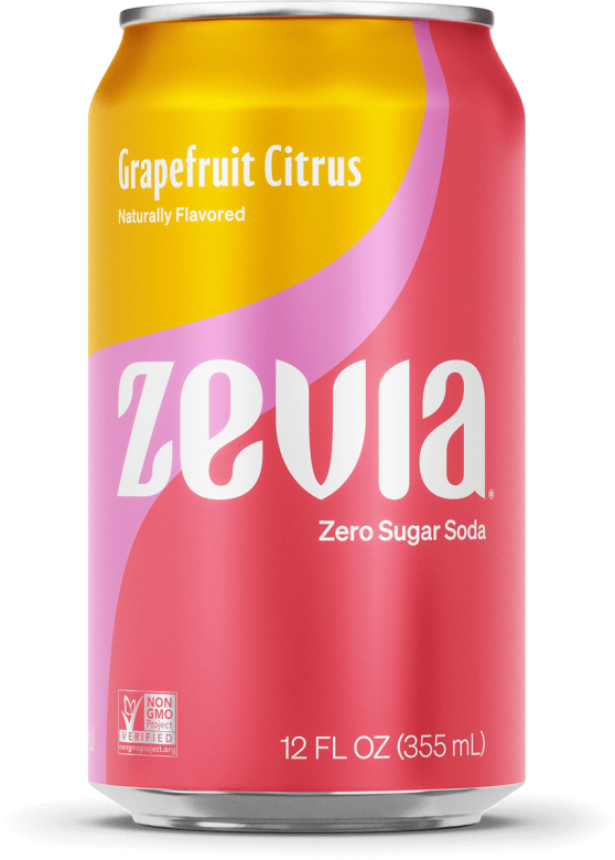
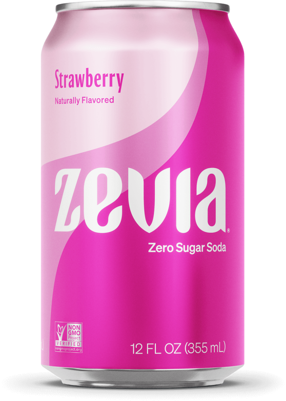
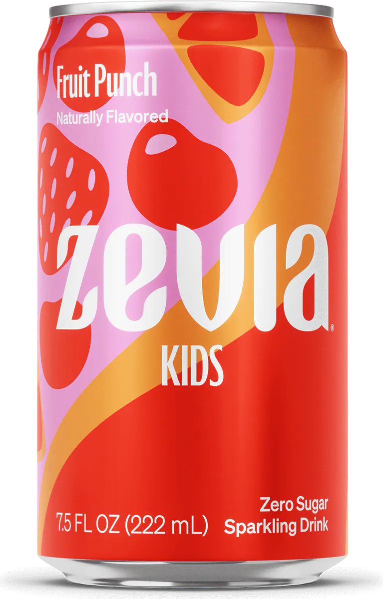
Our team presented a total of five concepts to Zevia, mine moved forward into development and final production. The idea for the word mark and can design was rooted in the stevia leaf. Leafy terminals and natural curvature, combined with modern type styles and bright colors. The core cans and final renditions of the word mark were developed. I then produced the files for the kids cans and aided in the design of both tea and energy.
Credit: TurnerDuckworth
Creative Director: Daniel Ioannou


